ทุกคนอาจจะจำโลโก้ของ Amazon ได้ แต่รู้หรือไม่ว่าโลโก้นั้นสื่อถึงอะไรบ้าง ? ลองมาดูความหมายที่ซ่อนอยู่ในโลโก้ของ 20 บริษัทเทคโนโลยีชั้นนำกัน
ปล. โลโก้ที่จะนำเสนอต่อไปนี้เป็นโลโก้จากต่างประเทศ จึงอาจมีบางบริษัทที่ท่านไม่รู้จัก จึงขออภัยมา ณ ที่นี้ด้วย
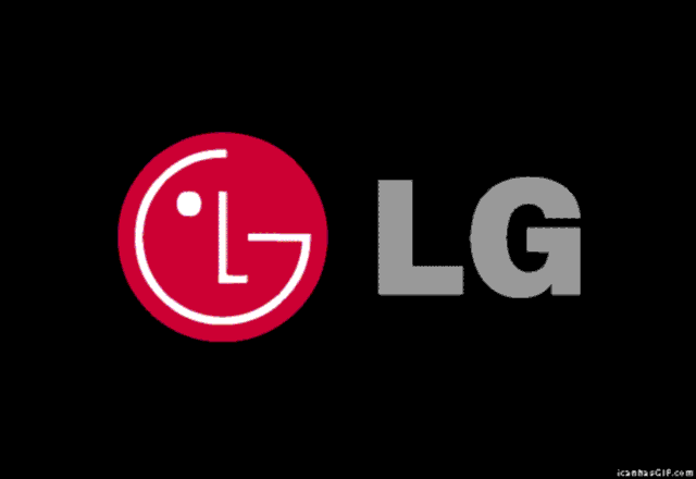
- 1. โลโก้ของ LG มีตัวอักษร L และ G อยู่ด้วยกัน นอกจากนั้นยังดูเหมือนกับสัญลักษณ์ของปุ่มเปิด/ปิด และถ้าหากจัดเรียงโลโก้ใหม่ ก็จะได้ภาพ Pac Man อีกด้วย
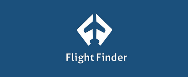
- 2. โลโก้เก่าของ Flight Finder นั้นออกแบบได้อย่างชาญฉลาด โดยมีตัวอักษร F จำนวน 2 ตัว ประกอบกันเป็นลักษณะเป็นเครื่องบินอยู่ตรงกลาง
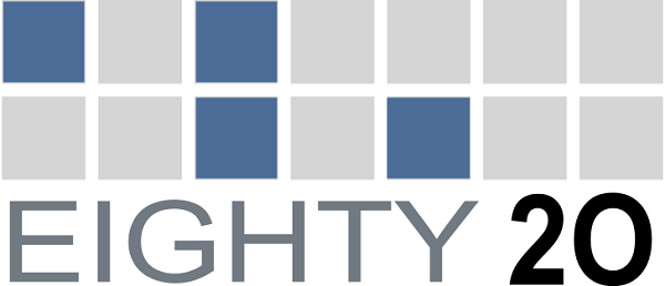
- 3. โลโก้ของบริษัทวิเคราะห์ข้อมูล Eighty20 สามารถแทนค่าด้วย Binary Code ได้ ดังนี้: บรรทัดบน, 1010000 เท่ากับ 80, บรรทัดล่าง, 0010100 เท่ากับ 20
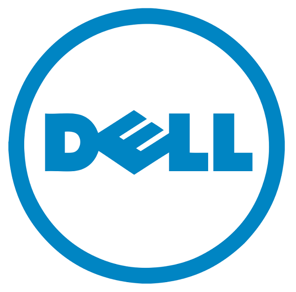
- 4. ที่มาของตัวอักษร “E” ที่เอียงในโลโก้ของ Dell คือ Michael Dell ผู้ที่ก่อตั้งบริษัท Dell ต้องการที่จะสื่อถึงความต้องการที่จะเปลี่ยนโลกใหัรับฟังกันมากขึ้น แต่บางคนก็ว่ามันดูเหมือนกับ Floppy Disk
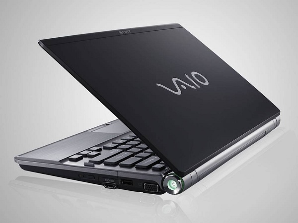
- 5. Sony ได้ออกแบบโลโก้ดั้งเดิมของ Vaio โดยให้ตัวอักษร V กับ A สื่อถึงรูปแบบคลื่นอนาล็อก และ I กับ O สื่อถึง Binary Code
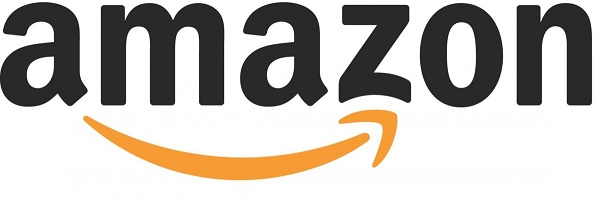
- 6. คุณอาจจะเห็นรอยยิ้มสีเหลืองในโลโก้ของ Amazon แต่มันก็ยังเป็นลูกศรชี้จาก A ไป Z ด้วยเช่นกัน
- 7. Facebook Places อดีตแอปเช็คอินที่ทำงานคล้ายกับแอป Foursquare ซึ่งมีลูกศรสีแดงชี้ลงมาที่เลข 4 ซึ่งเป็นการบ่งบออกถึงลักษณะและจุดมุ่งหมายในการทำงานของแอปนี้
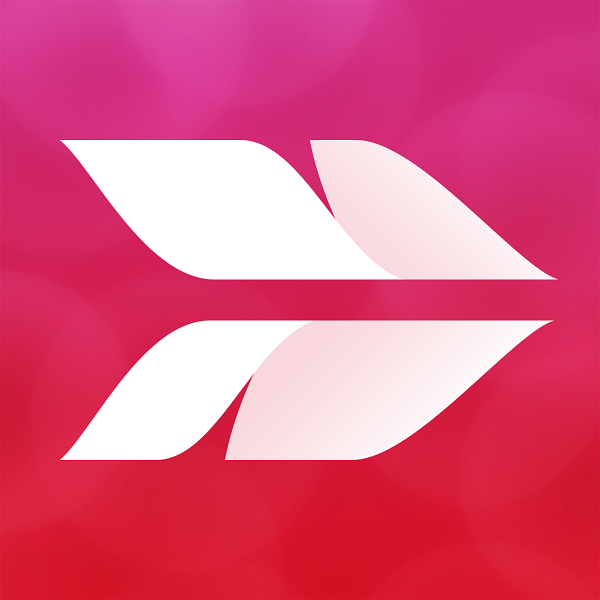
- 8. โลโก้ของ Skitch ดูเหมือนกับขนนกบนลูกธนู แต่เมื่อนำเงาสะท้อนจากกระจกมาต่อกันก็จะกลายเป็นตัวอังกษร S ด้วย
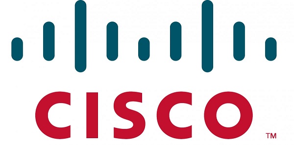
- 9. โลโก้ Cisco สื่อถึงสัญญาณดิจิทัลที่รวมตัวกันเป็นลักษณะของสะพาน Golden Gate ซึ่งตั้องยู่ในเมือง San Francisco ถูกนำมาใช้เป็นชื่อบริษัท
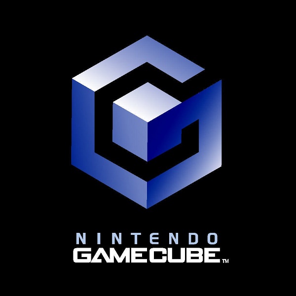
- 10. โลโก้ Gamecube ของ Nintendo นั้นยอดเยี่ยมมาก เพราะมันไม่ได้เป็นแค่ลูกบาศก์ (Cube) ดังชื่อของมันเท่านั้น แต่มันยังแสดงให้เห็นตัวอักษร G ที่มีพื้นที่ว่างคล้ายอักษร C อีกด้วย
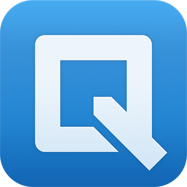
- 11. โลโก้ของ Quip นั้นมีลักษณะเป็นตัวอักษร Q แต่มันก็ยังดูคล้ายกับปากกาที่กำลังจะเขียนลงบนแผ่นกระดาษอีกด้วย
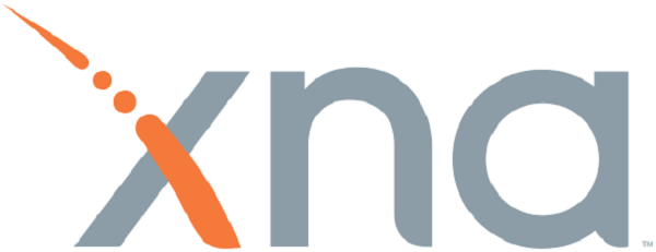
- 12. โลโก้ XNA ของ Microsoft ซึ่งเป็น Developer Tool ในการสร้างเกมส์นั้น ได้มีการนำเอา “รหัสมอส” (Morse) มาสื่อถึงคำว่า XNA โดย “— · · —” หมายถึว X, “— ·” หมายถึง N, และ “· —” หมายถึง A
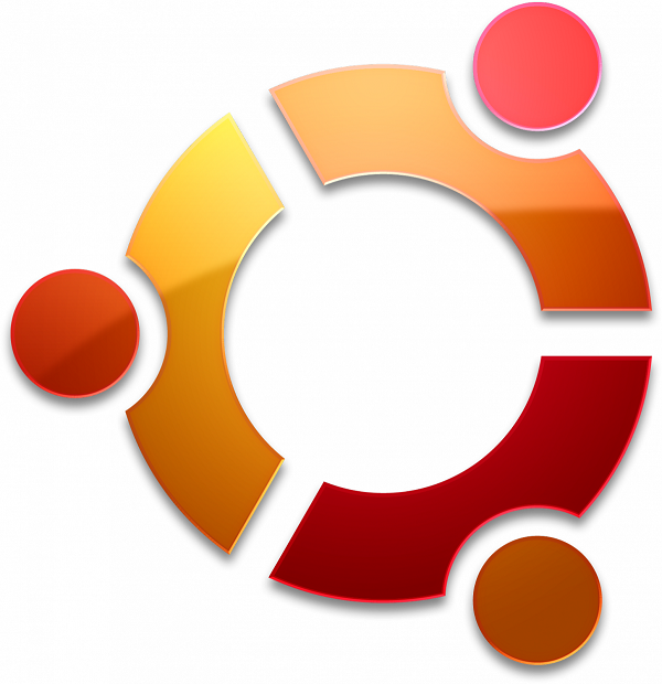
- 13. โลโก้ของระบบปฏิบัติการ Ubuntu สื่อถึงคน 3 คนที่กำลังจับมือกันและเงยหน้ามองขึ้นไปบนฟ้า
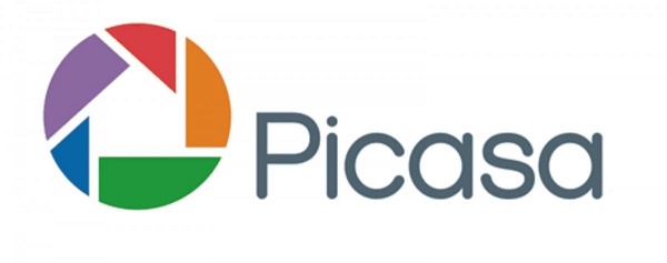
- 14. โลโก้ Picasa ของ Google นั้น มีคำว่า Casa เป็นภาษาสเปนแปลว่า “บ้าน” และบ้านก็ได้ปรากฏอยู่ในรูปชัตเตอร์หลากสีของโลโก้นี้
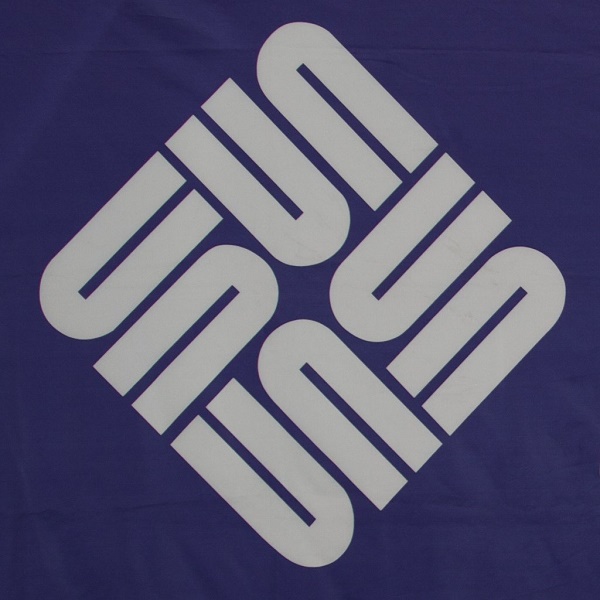
- 15. Sun Microsystems เคยถูกซื้อกิจการไปโดย Oracle เมื่อปี 2010 แต่โลโก้อันเรียบง่ายของมันก็แสดงให้เห็นความชาญฉลาดในการออกแบบ โดยใช้ตัวอักษร U มาเรียงต่อกันในกรอบสี่เหลี่ยม เกิดเป็นตัวอักษร S และ N ที่รวมกันเป็ฯคำว่า SUN
- 16. โลโก้ของ Claimair มีลักษณะเป็นเครื่องบินกระดาษ แต่นี่คือการเล่นคำในเชิงภาพที่ยอดเยี่ยม (Claim – Air) ซึ่งบริษัทนี้จะช่วยในการจัดทำเอกสารในกรณีที่ลูกค้าต้องการร้องเรียนไปยังสายการบิน
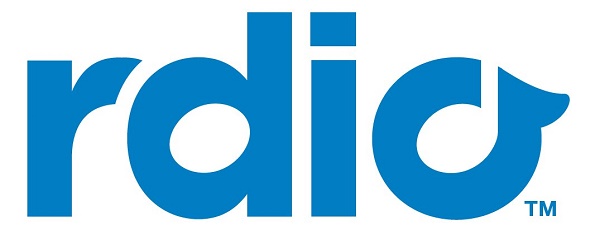
- 17. โลโก้ของ Rdio ใช้พื้นที่ว่างในตัวอักษะ “d” และ “o” ในการสื่อถึงตัวโน๊ตดนตรี (Rdio ถูกฟ้องร้องล้มละลายเมื่อปี 2015)
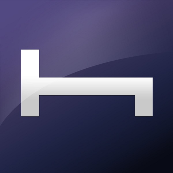
- 18. โลโก้ของ Hotel Tonight มีลักษณะเป็นเตียงนอน
- 19. โลโก้ของ Just In Case ประกอบไปด้วยภาพที่สื่อถึงกองเอกสารที่ถูกผูกมัดด้วยริบบิ้น
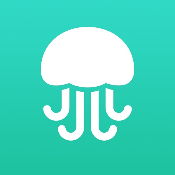
- 20. โลโก้ของแอป Jelly จากผู้ร่วมก่อตั้ง Twitter นั้น ดูเหมือนกับแมงกะพรุน แต่มันก็ดูเหมือนกับสมองด้วยเช่นกัน
ที่มา : techinsider